Showing posts with label painting. Show all posts

Tuesday, December 6, 2011

Sigh

Okay, so.  I've been M.I.A.  I know.  What can I say?  I've been super busy watching TV.  Also, I went home for Thanksgiving, which was awesome.  So, those are my excuses.

In Painting class, I've finished the still life.  It turned out pretty well, I think.  Take a look at the finished product.

I changed a few things around, some colors, and fixed the flowers and leaves.  Overall, I'm happy with it.  Some things could be different, but I'm content.

Our next and final painting to do is actually two paintings.  Two small little canvases, using the same composition, but having to paint them completely opposite.  Meaning different colors, different thickness, different texture, different EVERYTHING.  It's actually a lot harder than it sounds.
I chose a picture of an orchid I found.  I made the first painting basically just the same as the picture.
I think it's pretty, right?  I like to think so.  I really like it, anyway.  So, how do I make it the opposite?  At first I was going to just use complimentary colors, but then I realized that the next painting would still just be red and green.  So I decided to use different colors.  I decided to make the flower blue, but go reverse as to how it's laid out in the first one.  Meaning, where it's white in the above painting, it would be the darkest blue in the second painting.  And where it's a dark red, that part will be white.  I also decided not to blend the shades as much, and instead leave them stripe-y.  And the edges will be blurred with the background.  So, here's what I've got so far:
In the background, I am going to make some kind of multi-colored pattern, or something.  I don't really know yet.  I am TOTALLY up for suggestions...but this is due tomorrow.  Yikes!  Maybe I can get him to extend it til the final next week.

On to drawing.  
After the whole skeletal disaster, we moved onto ink.  At first, the ink gave me a lot of trouble.  It's hard to control, it's hard to get the shade right, and you can't erase or fix anything at all.  When it's on there, it's permanent.  For the assignment we had to do a landscape.  A quick Google search and I found a simple enough picture to copy.  So here is my ink copy:

At first, I didn't really like it.  Well, scratch that.  I didn't dislike it, but I wasn't crazy about it either.  We all hung our pictures on the wall, took a good look, and after a few minutes the professor asked "Which ones stand out to you?"  And the first one pointed out was mine!  By like, 5 people!  I was floored.  Even the professor after class was like, "Hey, how about that, people actually liked your drawing for once!"  Yeah, thanks jackass.
These were a couple other ones I really liked.  Specifically the forest one.
Today we started our last new thing, and I was sooo nervous about it.  We started doing figure drawing today.  As in the human figure.  As in the naked human figure.  We did a man today, and we're doing a woman on Thursday (that's what she said).  More on this later.  For now all I'll say is, it's not nearly as bad as I thought it would be.

In 3D Design, I just finished my work on the roses.  When we last left off, I had finished the roses and the vase with the foam board.  I had to decide if I wanted to paint the roses, the vase, both, or neither.  My issue with painting the roses is that, because they were so tightly wound and had the hot glue already, it would be tricky if not impossible to make it not look messy.  But then I had this idea about Alice in Wonderland, and the whole "Painting the Roses Red" scene...


So after that I just had this whole vision of the roses being white but painted red, and they're sitting on a vase in the Queen of Hearts's castle but she doesn't even notice...okay, well, now I'm off in my own little world.  But you get the idea, I hope.
Basically what all this means is that I painted the roses red, but you can tell that they've been painted.  Here's the finished result:

Everyone was really impressed by the vase because it's hard to cut foam board so cleanly and neatly.  Overall, I'm really happy with how this project turned out for me.


The last thing is ceramics.  I don't ever have any pictures from this class, which you can all thank me for later because it's never anything good that comes out of there.  Once I get a few pics, I'll be able to explain the project.


Ok.  Wow.  What an update, right?  All I have to say is, thank GOD the semester's almost over.  And then what?  I'll have all this leftover art supplies, like paint...and charcoal...and a wooden smoothing tool.  What am I going to do with all of this crap?

Friday, November 18, 2011

I'm all caught up in my classes!  Even ahead in some.  I think I'm starting to do well in painting, while I seem to be getting worse in drawing.  Ceramics I'm starting to like more, too, even though it is soo super messy.

Painting:  The still life is nearly done, I just have to do some cleaning up and touching up this weekend.  This is the scene we had to work with:

I cut it down a bit, and the professor said we can mess with the colors and even make up the shadows.  My view is slightly different because I stood farther back.  But this is what I've worked on so far:
So, obviously I changed the colors.  But I'm really happy with how the pots turned out.  The shading is pretty good, I think.  I have worked on it since I took the picture, but nothing big has changed.  I'm still working on the flowers and the bottle.  Hopefully I can get another A on this and finish strong.

Drawing: We spent so much time drawing skeletons and bones, and I absolutely hated it.  There was just something about it that I couldn't get, and no matter how much I tried I couldn't get it down.  These are the best ones I ended up with.


And everyone else did sooo well.  Again, I felt like crap in this class.  I've started to really hate it and dread going in the morning.  
We just started on working with ink, so we'll see how that goes.

Ceramics:  I've finished my big piece that I was working on.  All set to be fired, and then I'll glaze it.  Here's how it turned out.
I still don't really like the supports, but I tried to take them out and it nearly collapsed on me.  It was a bitch trying to put them back in, but it turned out alright.  I think it was pretty successful.  I put some slip paint on it before it gets fired, so then the glaze I put on will turn out in different colors.
Speaking of glaze, I finally glazed a piece and got it fired.  Remember one of the original pieces, the manipulated slab?  Well, I dipped it in a really cool blueish green glaze.
 

It's kind of metallic-looking, and pretty cool if I do say so myself.  You can see in the second picture that it must've gotten stuck to or burned by something in the kiln.  Geez.  Thanks, professor!

3D Design: Today in class I made a vase for the flowers.  It took a lot longer than I planned because the first one I made was terrible.  So I made it a simpler design, and it looks much better.


The reason it took so long is because of the side.  I had to cut out a strip, then score, break, bend, and fold every half inch so it could twist on the sides.


But basically the whole point of this is, I'm all caught up in everything!  Hmm, I feel like I should find some wood to knock on or something.


Sunday, October 30, 2011

A Hockey Hiatus

On Thursday my hockey team left campus to travel to Baltimore and Philadelphia for our final games of the regular season.  This week, we travel to Norfolk, Virginia to play in the Colonial Athletic Association (CAA) Conference Tournament, for a chance to qualify for the NCAA tournament.  We're leaving on Tuesday evening, so I am missing a whoooole bunch of classes.  Not that I have any problem with that.  I just hope my professors are understanding...

So that's why I won't have any new updates for awhile.  Right now in...
Ceramics: I've just cut out the spiral in my 14-inch piece.  Hopefully it doesn't completely dry out over the weekend.
Drawing: we're learning "perspective" and "vanishing points."  I am putting those in "quotations" because it's all a bunch of made-up stuff that forces me to use a ruler and measurements in a drawing of a cube.
Painting: we turned in our reproductions on Wednesday.  I was done with mine last week, and I already know I got an A on the project.  Apparently the next painting is a still-life (shocker).
3D Design: I'm so behind in this class because it's only once a week and I missed last week and will miss this week.  We're still supposed to be working on the same project, the one with foam board and no right angles.  Still trying to figure this one out.

Once hockey is over, I'll be able to really catch up on everything and hopefully do well on the projects.

But hopefully we'll be missing next week too for NCAA's!  It's a long shot, but cross your fingers!

Wednesday, October 19, 2011

Van Gogh Reproduction

My Van Gogh reproduction has turned out really well.  So well, in fact, that my professor told me today (and the painting isn't due for another week) that I have a guaranteed "A" for this painting.  YAY!


Is it sad when I say that this is the best work of art I've ever created?

Screw it.  I'm proud.

Wednesday, October 5, 2011

An All Around Update

I've gotten my first grades back in both drawing and painting.  And both grades were a B.  UGH.  It's just annoying because, especially in the drawing, I tried really really hard.  I mean really hard.  I'm just worried that these classes are going to really hurt my GPA.  A personal goal I set for myself is to be on the NFHCA Academic Squad and receive the CAA Commissioner's Award all four years of college.  You need a 3.3 GPA to get those awards, and I've gotten them for the past three years.  I can't screw up my last year because of these stupid art classes!

Okay, I take it back.  They aren't stupid.  But it's still frustrating.

Anyway, here's a quick little update.

Painting: First project got a B.  But we did a class critique where we drew a number that corresponded to someone's painting and we had to critique that painting on use of color, composition, craftsmanship, etc.  My professor told me after class that I had the best critique in the class.  So, apparently, I can't paint well, but I can certainly tell others what to do and how they need to fix it.  

Hmm.  Maybe I should change my major to psychiatry.

Drawing:  Our abstract assignment is done.  And I am really surprised about the outcome.  Here is how my composition turned out.

And my professor actually liked it!  His biggest critique is that I could use the white of the paper more to let some more light come through the drawing.  But, I don't know, I still just don't get it!  It's just a bunch of shapes and textures.  I don't really like it at all.  But for some odd reason he really responded well to it.  I even said in class that this sort of thing isn't the kind of aesthetic I respond to.  I think it's harder to draw a glass bottle than to make up a bunch of shading on a paper.  I just hope this is the last thing we do with this sort of topic...but I doubt it.
This is the one that I responded the most to:

Not many "textures," just the shading really.  But it was alright.  For this kind of thing, at least.


Ceramics: I'm in the process of firing my manipulated slab piece.  After it's out of the kiln, I'll glaze it.  My profile piece I just painted with slip glaze today, which will then be fired and will come out already colored.  I tried to do a blue with green on top kind of dripping and swirly, but I don't think it worked.  But this was just a test, since I'm not really fond of the profile anyway.  We also started work on the wheel on Tuesday!  It's definitely challenging and will take some getting used to, but I really like it.  I actually went back into the studio today to work some more, and I made a cute little pot.  Unfortunately with all the clay all over my hands/arms/shirt/pants/hair/face, I couldn't get my camera out to take a picture.  Maybe next week.  Seriously, the only bad part about the wheel is the clean up.  It's sooo messy.

3D Design:  Nothing.  Don't have class til Friday.

And....that's about it.  Remind me to tell you about my "trip" to the Metropolitan Museum of Art.  That's a great story, for when you're having a bad day and want to feel better about your life.

Monday, October 3, 2011

Painting Project #2

I am finally finished with the first painting project.  You know the one.  The one with the shapes and shades and all that other boring crap.  Here is the final outcome:

I was working on this thing last night, late enough that the janitor walked into the studio and had to leave when he saw me still in there.  There are some obvious changes from my first couple coats, but I think in the end it turned out okay.  There are some shades that obviously look similar, but it came to a point where I had to stop trying to make different colors because I kept accidentally making the same ones.  I think it's fairly clear that my dominant color is blue, right?  And in this picture, some of the oranges don't look so orange, but rather brown or red.  But in the painting, I think you can tell.

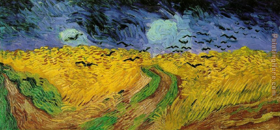
We got assigned our second project today, and wouldn't you know it, it's another reproduction!  These beginning art classes just looooooove having us make reproductions.  Apparently we're not skilled enough to be creative on our own.  Anyway, we had the choice between paintings by Guaguin, Van Gogh, and my food friend Cézanne!  Yeah, no way in hell am I going back to that Still Life with a Ginger Jar and Eggplants.  So, I chose a Van Gogh painting.  Here it is:

"Wheat Field with Crows"

You may think at a glance it's pretty easy and simple.  But take a closer look.  Those individualized wheat crops in that field are gonna be a challenge.  I think the brush strokes in this painting are really beautiful, and I'm really excited to make my own version.  In fact, I was so excited that I stayed late after class and got to painting.  First I blocked it all out with charcoal, but since there's not really much besides the landscape, I jumped into the paint.

Here's the first coat:

I'm coming across a couple problems already.  First of all, the printed out version I have is a lot brighter and more vibrant that other versions I'm coming across.  I'm gonna have to decide whether I want to go for the bright and bold or the light and dull.  I am also having a little trouble mixing the right green, but hey, it's just the first coat.

I'm really excited about this painting!  Since I've already got a head start on it, I'll hopefully be able to spend a lot of time on this one.

Monday, September 19, 2011

Painting Update

Today in painting class, we started on our second coat of paint.  So now we're having to decide what's going to be our "dominant" color and our "subdominant" color.  I chose blue as my dominant, and so since the subdominant has to be the complement, turns out it's going to be orange.
I just hope people don't confuse me for a Gators fan by the end of this thing.

Here's what my painting looked like after the first coat:
Thrilling, I know.
Now here's what I've got on coat #2 so far:
You can kind of tell which ones I've gone over and which ones I haven't.  I'm not really going in any sort of order.  I end up just mixing some colors together, picking a random shape, and going for it.

Hmm.  Maybe that wasn't such a good idea...

Thursday, September 15, 2011

Painting Project #1

I originally hadn't signed up for a painting class, but it ended up fitting into my schedule so I figured, why not?

The first day of class we weren't able to do much because we had ordered painting kits from the Utrecht Art Supply store in Carle Place.  But when they were delivered they were mixed up with some kits from the advanced class, so we didn't have the right colors, brushes, etc.  I tried to keep mine because it had a lot more paints, but they caught me.  So sad.

Anyway, the first project we were assigned is a pretty basic one, and, sorry to say, kind of boring.  We divided the canvas into three rows of four, so 12 squares total.  Then we had to divide each square into three geometric shapes.  So there's 36 shapes total on the canvas.  Using only the primary color paints, we have to paint each shape a different color.

Exhilarating.

The primary colors (blue, red, and yellow) will make the secondary colors when mixed together (purple, orange, and green)- you know, just in case you didn't learn that in elementary school.  And we did have three shades of blue, two shades of red, and two shades of yellow.  We could also use white to lighten the shades a bit, since we weren't allowed to use any of the colors straight out of the tube.  But I feel like I just ran out of colors as I got to last few shapes.  Or they were at least starting to look like each other.

The next step is to cover the first layer with a second layer of paint.  Now we have to start picking a "dominant" color that will be repeated throughout the painting.  So if I chose blue to be my dominant color, I'd have lots of shades of blue ranging from blueish-green to blueish-purple.  But then we have to have a "sub-dominant" color also present, which would just be the complementary color.  So blue's complement would be orange.  Then we'll go over it with a third coat of paint so even everything out and make it smooth.

Like I said, not too exciting.  I don't have a picture of it yet, but trust me you aren't missing much.  Let me just say, thank God we have to go over the first layer because mine is uggggglyyyyy.